Saas feature design
Digital Bridge: The Form That Unlocked the Platform
Redesigning a broken, unsaveable submission form into a structured wizard, helping Berlin's digitalisation network, funded by BMWK, finally capture and share the project knowledge it had been losing to drop-offs.
Enter the password to view the full case study.
Role
UX Researcher
IA & IxD
Platform
Web - desktop primary
Deliverables
Form wizard +
Design system
Industry
GovTech / Public Sector SaaS
Duration
5 months,
May 2023 - Oct 2023
Team
PRODUCT And THE PROBLEM
Digital Bridge is an initiative of the Berlin-based competence center (funded by the BMWK). The platform connects SMEs with free, vendor-neutral digitalisation support and serves as a living knowledge base of implemented projects, so other SMEs can learn from and replicate real solutions.
Partners and competence centres, the experts who had run these projects, were meant to document and share their work through a submission form. The form covered everything: description, process, media, contacts, and results.
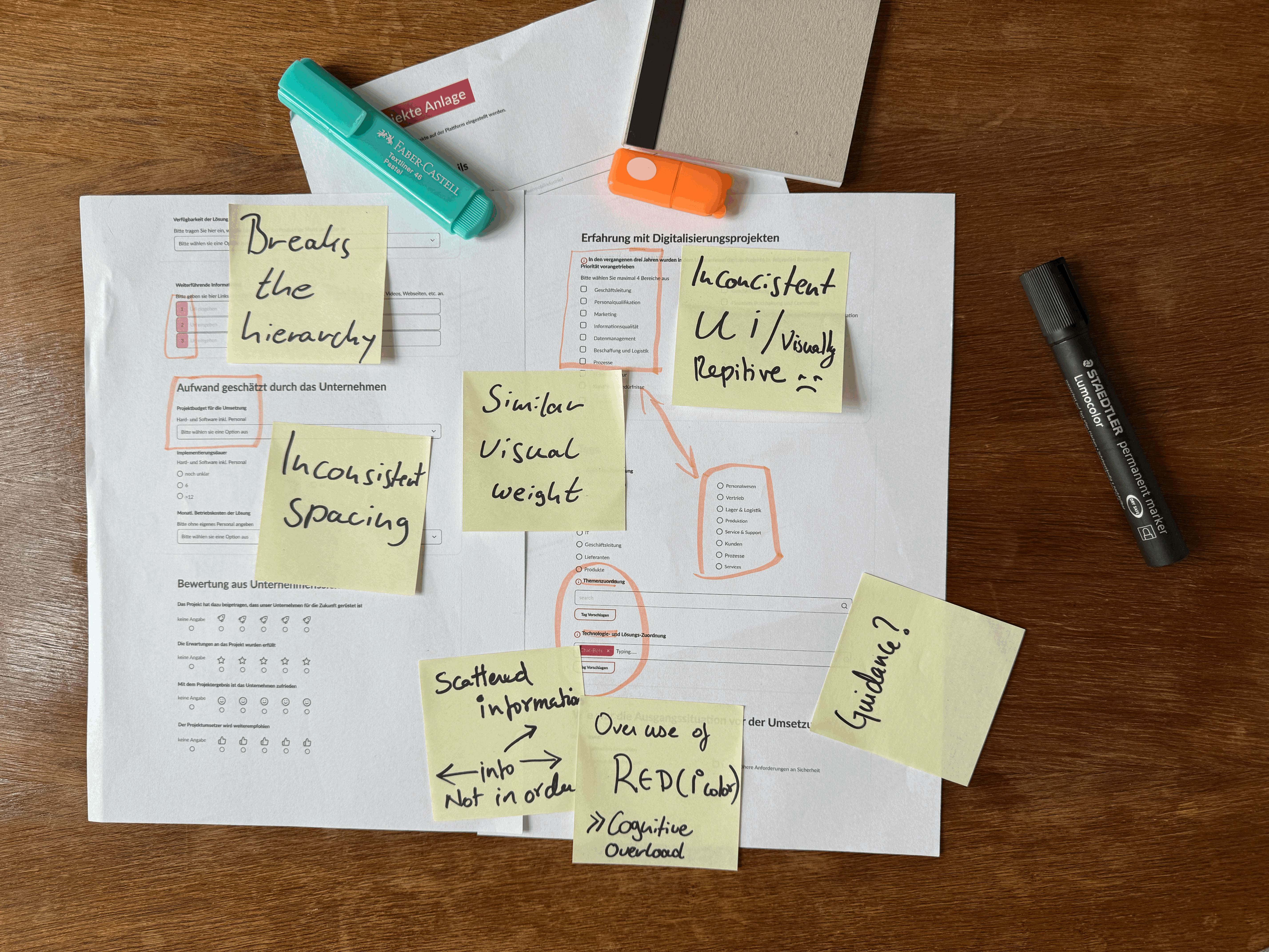
It was failing. A single endless scroll with no save option. Leave halfway, lose everything. The UI was inconsistent and rough, the information order was jumbled, and fields were duplicated.
The result: high drop-off rates, incomplete submissions, and a knowledge base barely growing.
business need
One continuous page. Leave halfway, all progress lost. No return path.
business need
Low partner participation
High effort and complex submission process. Unwillingness to document projects.
user need
Endless scroll and no save
One continuous page. Leave halfway, all progress lost. No return path.
user need
Inconsistent and rough UI
Varied components, no shared language. The form felt untrustworthy.
RUNNING IN PARALLEL
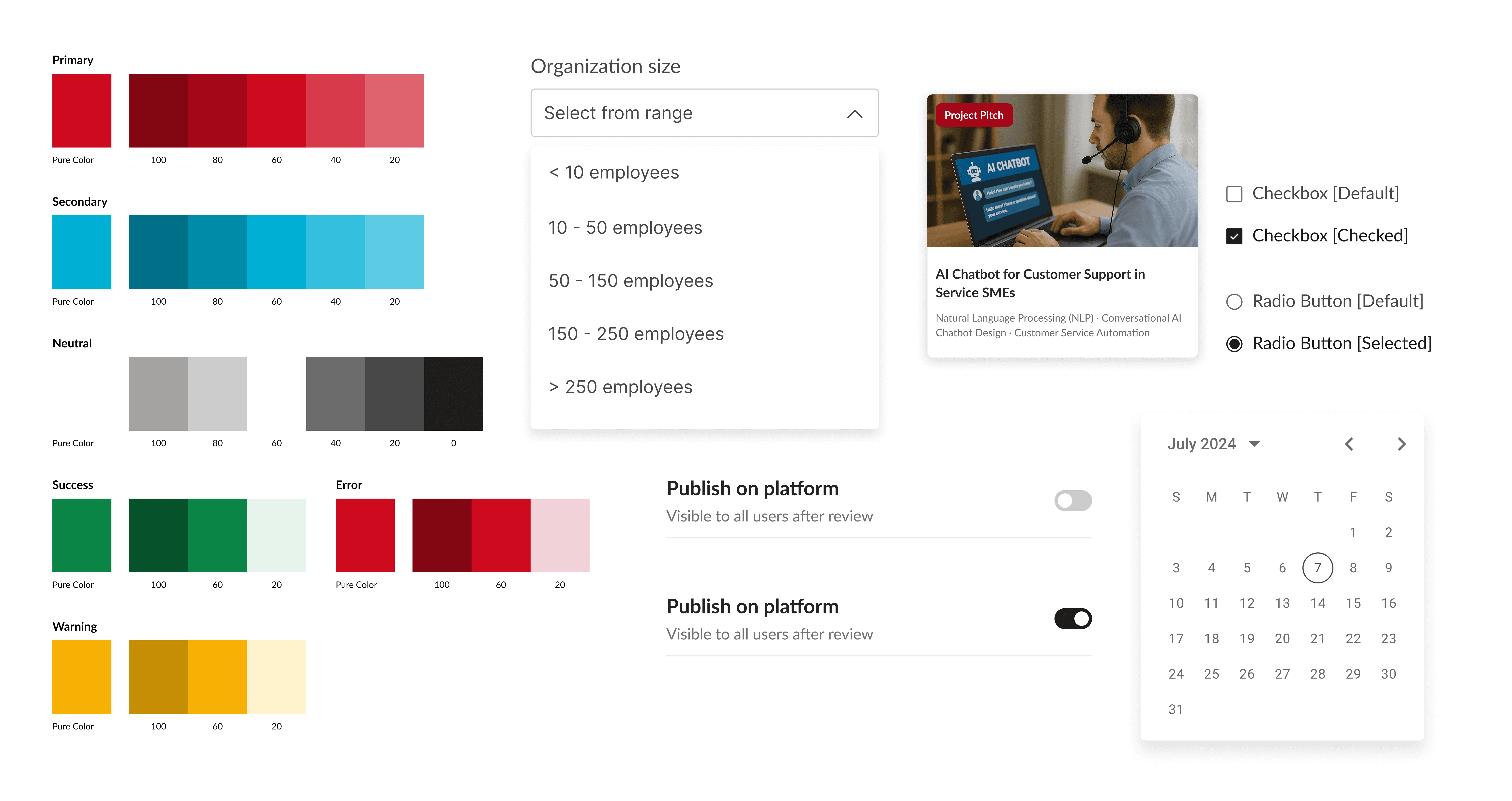
Building a design system
Alongside the form, the platform's UI had no shared language. A component library was built in parallel, bringing consistency to buttons, inputs, labels, and states across the entire platform.
ROLE AND CONTRIBUTIONS
Brought in to diagnose and fix the submission form, and to address the broader UI inconsistency alongside it. Worked across research, IA, interaction design, and design system in one continuous effort over 5 - 6 months.
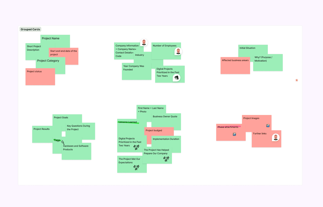
Interviewed competence center coordinators and observed real users (experts) filling the form live. Audited every field against what the platform actually needed downstream, identifying what to remove, merge, or reorder.
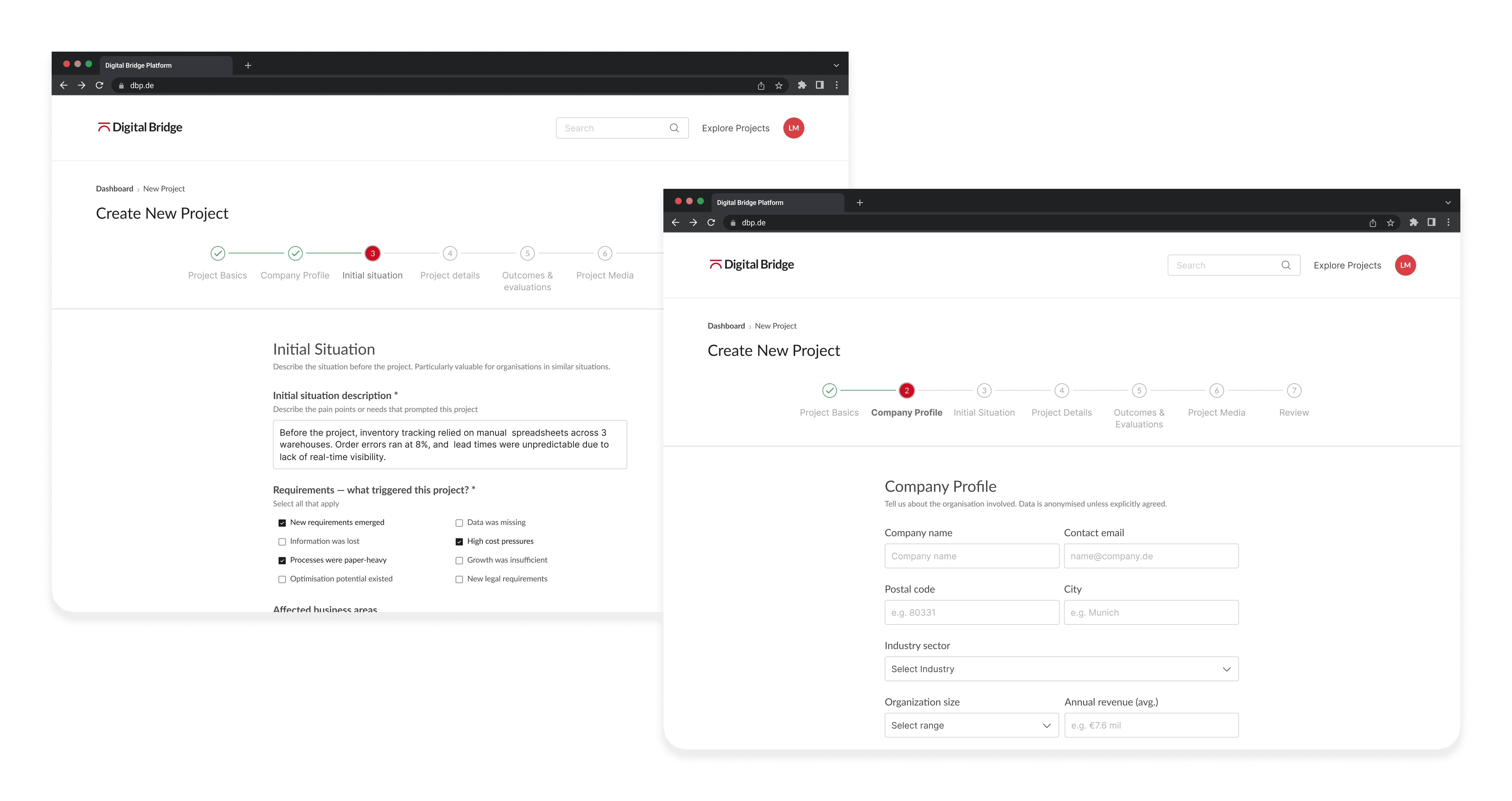
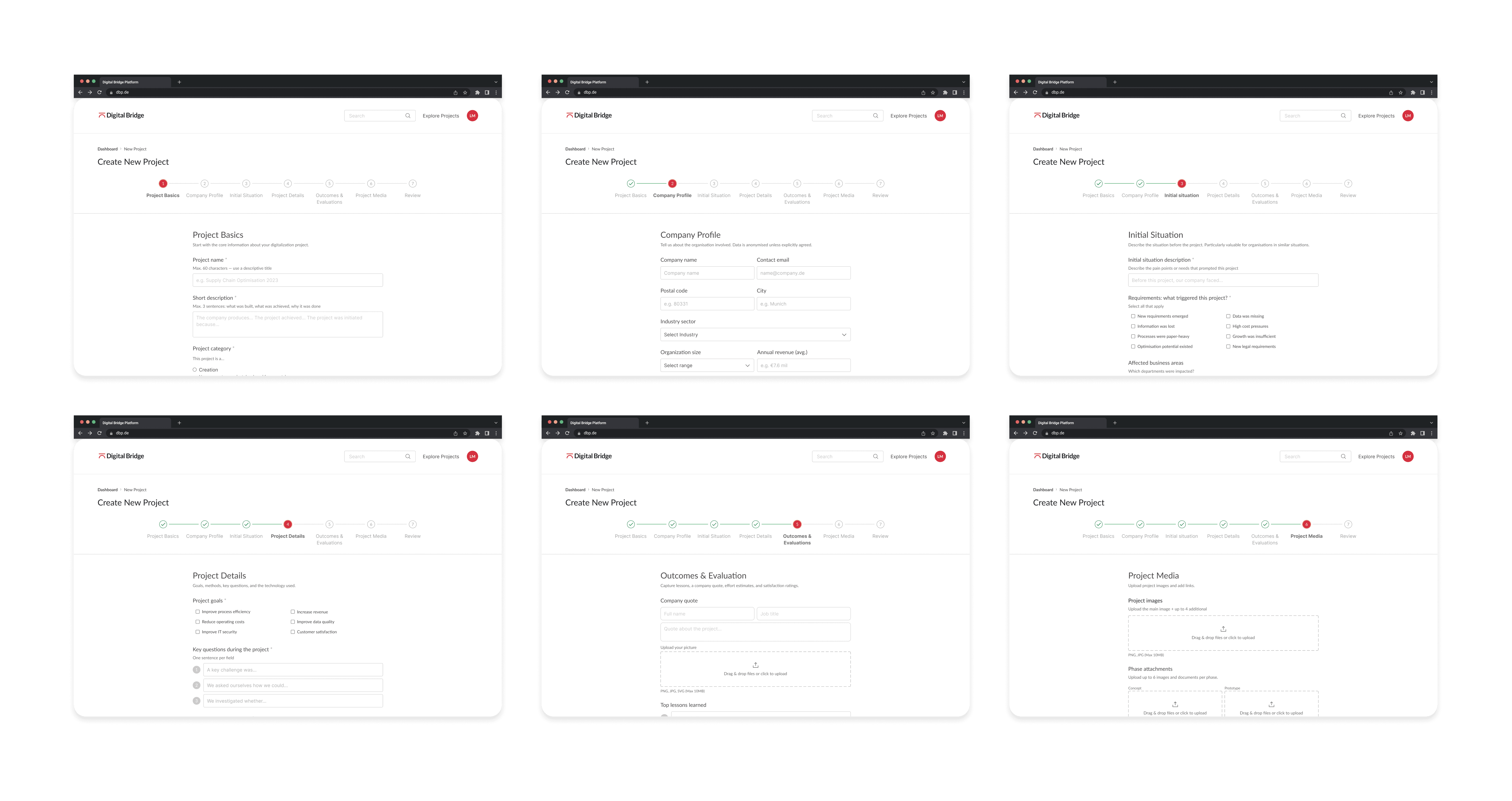
60+ flat fields restructured into a 7-step wizard: organisation, project description, scope, requirements, and final review.
Introduced save-draft at every step. Added guided inputs, helper texts with real example placeholders, and character counters. Shifted the colour system from an overused primary red to a black-led UI, red reserved for errors and moments that genuinely needed attention. Validated through an A/B-tested click prototype measuring completion rate, time-on-task, and errors.


KEY DESIGN DECISIONS
decision 01
Steps over fields, architected structure builds confidence and trust
A single long form is exhausting; users can not see how far they are or what is coming. Breaking it into 5 - 7 named steps gave users a mental model before they started. Knowing what step you are on is fundamentally different from staring at an endless scroll.
decision 02
Black is UI primary, red only where it earns its place
Primary red used throughout diluted its own signal; it was everywhere while being nowhere. Moved to a black-primary system with red reserved for validation errors, warnings, and critical action moments, regaining its meaning.
decision 03
Guide, do not inntorogate
The original description field was an empty box with a vague label. Replaced with clearer labels, guided placeholder text, and clear helper texts. The highest drop-off field became the step users spent the most time in, engaged, not stuck.


OUTCOME
The redesigned form shipped and was adopted on the platform. Save draft, real-time validation, well-curved wizard steps, and guided inputs removed the friction that had been blocking submissions.
Abandonment rate reduction confirmed via A/B prototype testing.
The form was the bottleneck. Removing it let the platform grow. In the first 8 months, adoption grew significantly: active competence center participation increased from 1 to 7, implementation partners and experts contributing projects grew from 3 to 12, and documented projects expanded from 8 to 54.
The latest analytics from 2025 showed approximately 471% growth in active competence centers, 733% growth in contributing experts, and more than 1,100% growth in published projects since the initial rollout.
4
4
4
4
0
0
0
+
+
+
Stakeholder Ecosystem Coverage
1
1
1
1
0
0
0
0
0
0
0
0
+
+
+
Implementation Partners and Experts
6
6
6
6
5
5
5
0
0
0
0
0
+
+
+
SME Digitalizaiton Projects Documented


The design system built alongside became the foundation for all continued UI development, ending the pattern of inconsistent, ad-hoc visual decisions.