Overview
A mobile dashboard designed for chicken farmers to monitor feed efficiency, chicken and inventory. By transforming basic coop data into actionable insights, the app supports daily decision-making, early issue detection, and smarter farm management.
Roles
System Thinker UX Researcher & Designer Information Architect Interaction Designer

The Challenge
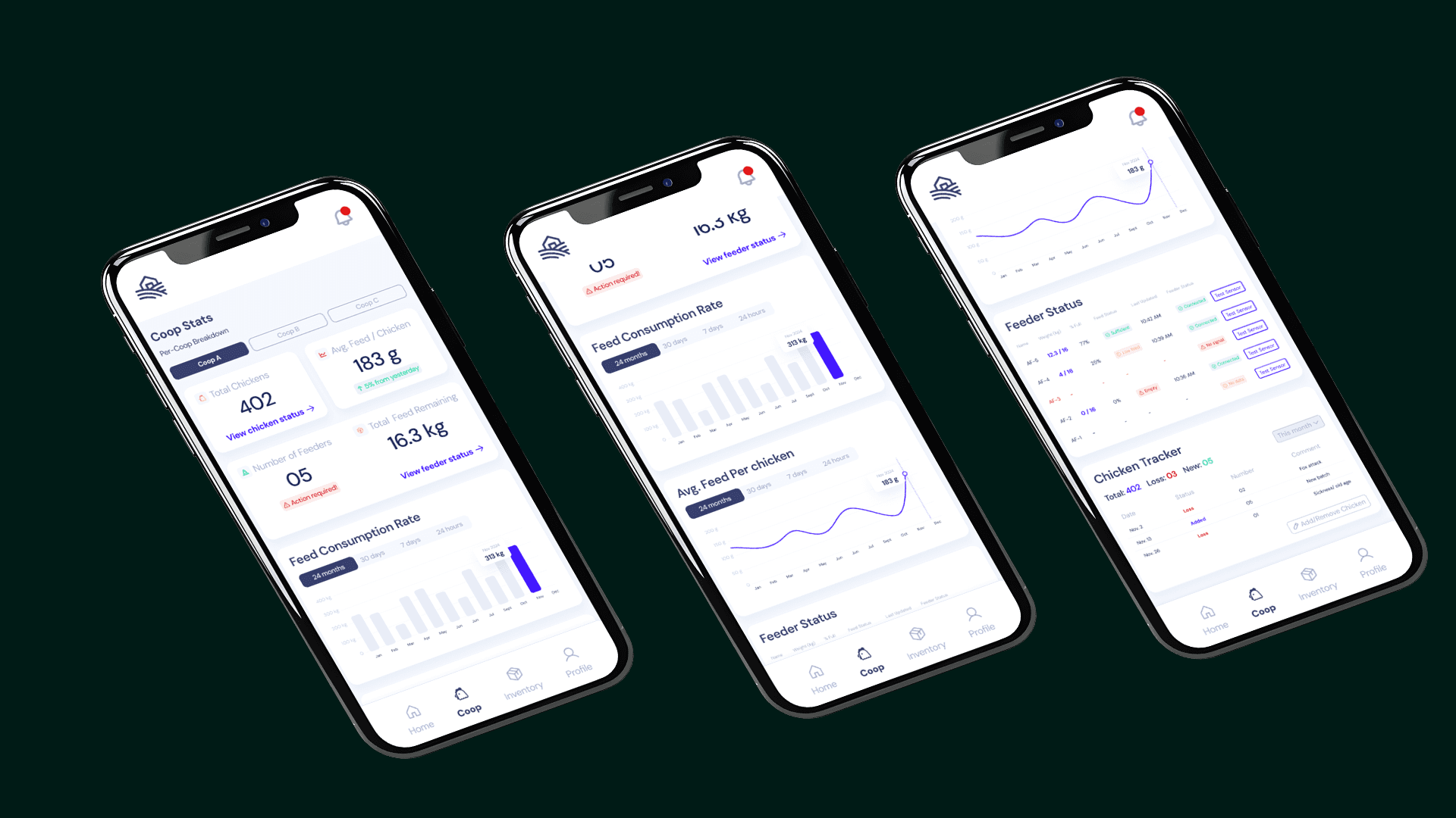
Farmers faced challenges in monitoring feed levels and managing inventory effectively due to lack of real-time data and insights. With only feeder weight and chicken numbers, farmers were unable to predict feed shortages, track consumption trends, or optimize feed costs.
The Solution
Our approach was to transform raw data into actionable insights by mapping the sensor data to practical solutions for farmers. We focused on providing real-time feed alerts, presenting feed consumption trends, and forecasting inventory needs. The design was kept minimalist, ensuring that key insights were accessible at a glance, with an emphasis on ease of use.
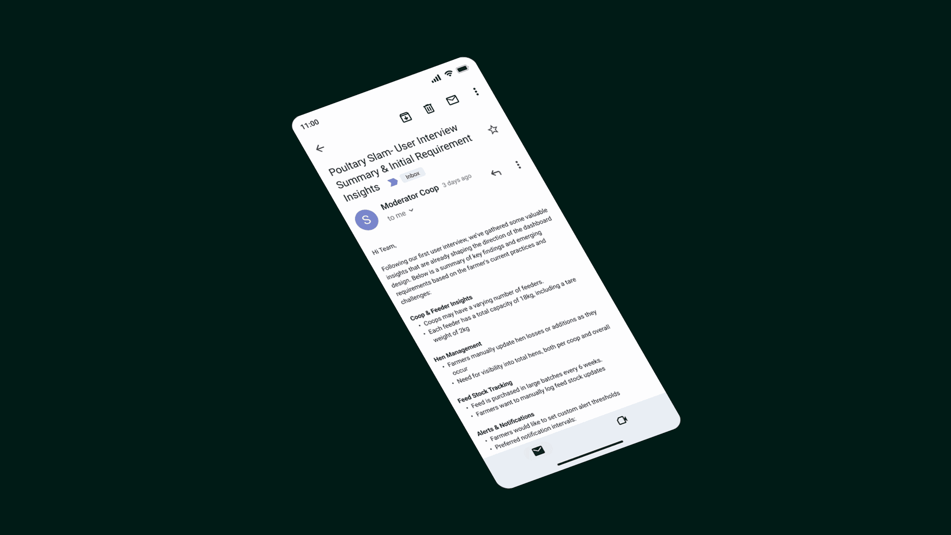
Understanding the Coop-Farmer
User interviews with farmer helped us identify pain points and understand their daily workflows. We focused on how they currently manage feed levels and what tools they use for inventory tracking.
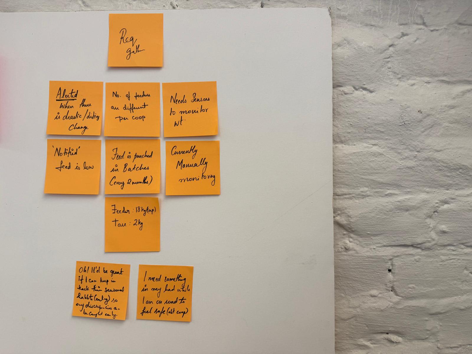

Cracking the Data Shell
Mapped out how to extract insights from the raw data (feeder weight and chicken count), turning it into trends, alerts, and predictions. The goal was to derive feed consumption rates, inventory needs, and cost forecasting from the available information.

Charting the Farmer’s Journey
After defining what insights could be derived from raw data, I mapped out the user flow to align those insights with real farmer tasks. This helped prioritize screens and ensure the dashboard reflects natural order.

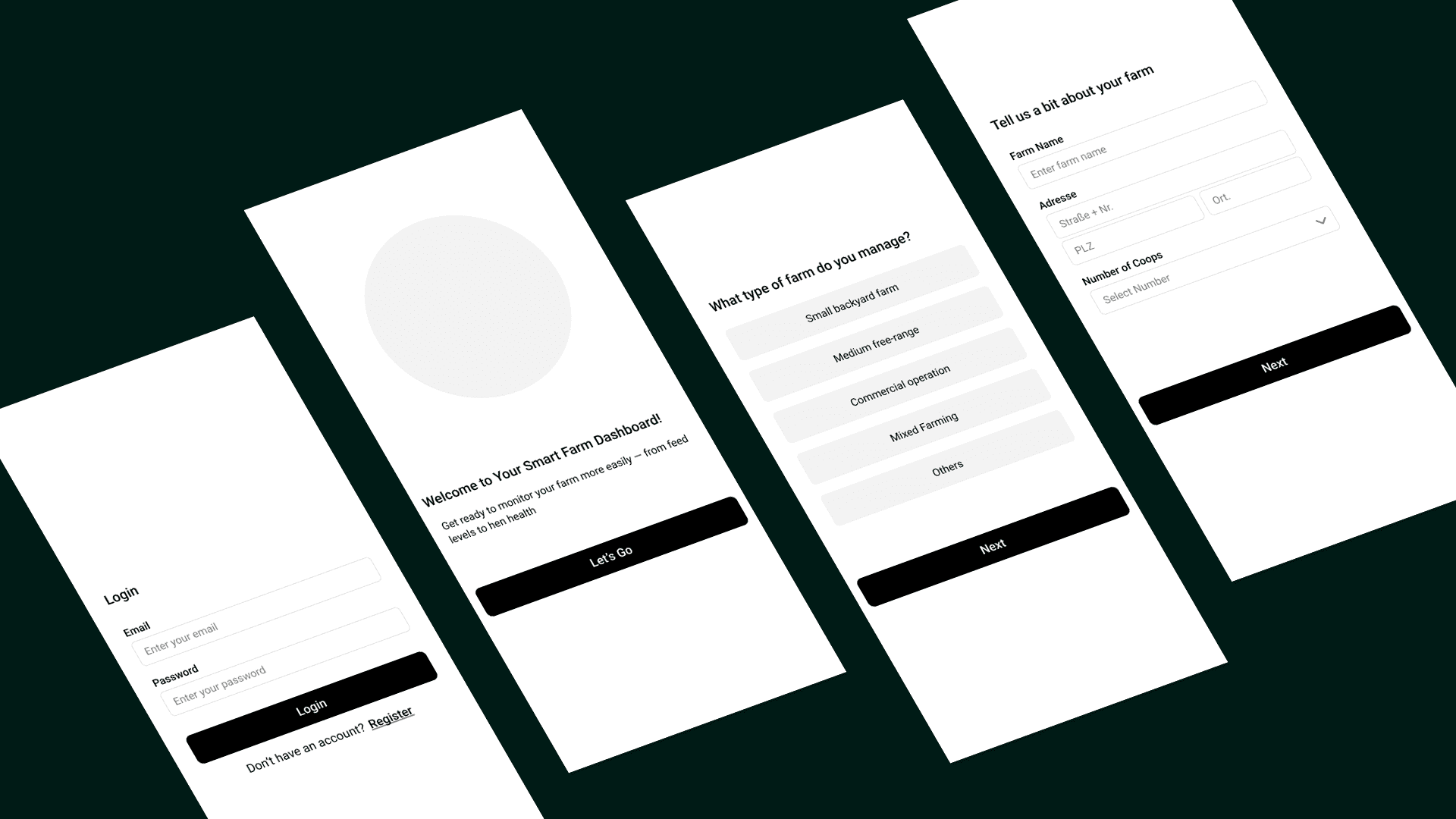
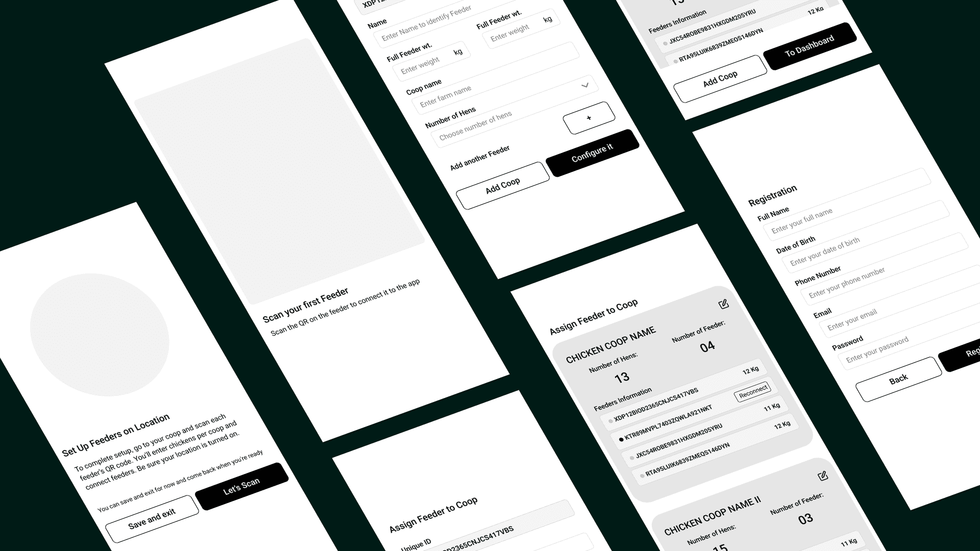
Structure first
Low-fidelity wireframes helped me organize key data points into a clear and functional dashboard. Emphasis was placed on intuitive navigation, scannable visuals, and actionable insights.
Polishing the Pecking Order
I refined the interface with clean, mobile-first visuals that balanced simplicity with detail. The final designs included alert customization, stock input flows, and feed-per-chicken metrics tailored to farmer priorities.


Impact
I packaged the UI components, interaction specs, and feedback learnings into a developer-ready handoff. Documentation was clear and annotated to ensure smooth implementation and iteration. While the final app wasn't built at this stage, the research-led design process gave the team and stakeholders strong confidence in the concept. Our validated prototypes and clear logic mapping secured approval to move forward.
Reflections
The main challenge was ensuring that the dashboard remained minimalist while still providing all necessary insights. Moving forward, integrating health indicators based on consumption patterns could further enhance the tool's value.